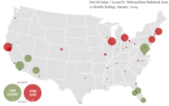
 I actually came across this map several days ago, but haven’t really gotten the chance to post it until now. It’s a time line and map representative of job gains and losses since 2004 and beyond. It’s rather interesting to see the way the job market has expanded and fallen over the past 5 years. It’s detailed enough that you can see the effects of the economy in places like New Orleans (Katrina) or Detroit.
It also reminds me of how crappy the job market is in Birmingham. Over the past 5 years, Birmingham has seen little to no net gains in the job market. At the rate things have been going, I get the strong feeling that I’m just in the wrong place for what I want to do…


